
Global COVID-19 Analytics Dashboard (SQL Server & Power BI)

Power BI Dashboard
1.Project Overview
This project analyzes global COVID-19 data sourced from Our World in Data to explore infection, death, and vaccination trends across countries and continents.
Using SQL Server for data preparation and Power BI for visualization, I developed an interactive analytics dashboard to monitor global health trends and assess vaccination progress.
-
Tools & Technologies
SQL Server | Power BI | Excel
-
Data
-
Volume: 85k+ records across 200+ countries
2.Objectives
-
Clean and transform COVID-19 data to ensure accuracy and usability.
-
Derive key performance indicators such as infection rate, fatality rate, and vaccination rate.
-
Build a Power BI dashboard to visualize metrics by continent and country.
-
Explore the relationship between infection rates and vaccination rollout over time.
3.Data Preparation and SQL Functions
The analysis began with importing daily COVID-19 records into SQL Server.
I used SQL queries, window functions, CTEs, and views to extract, aggregate, and transform the raw data before exporting results into Power BI.
-
Key SQL Techniques Used
-
Common Table Expressions : Used to simplify complex subqueries
-
Window Functions: Applied to compute rolling averages and cumulative sums without subqueries. Provided smoother visual trends for time-series Power BI charts.
-
Views: For reusability. Created several reusable SQL Views to standardize calculations and simplify Power BI integration.
-
Data Joins & Aggregations: Performed multiple joins between CovidDeaths and CovidVaccinations tables to unify infection and vaccination data by location and date. Aggregations provided global and continental summaries.
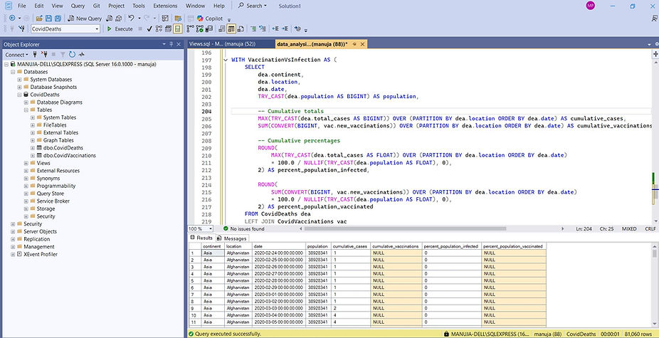
Querying with SQL Server
4.Dashboard Design
After data transformation, resulting tables and views were exported as CSV files and loaded into Power BI. Did data transformations in the Query Editor including changing data types, unpivoting columns etc.

Power BI Data Model
-
Key Visuals
-
Global Summary KPIs – Total cases, deaths, and death percentage
-
Deaths by Continent – Horizontal bar chart for total deaths
-
Infection Percentage Map – Choropleth map showing country-wise infection rates
-
Infection Trends (G7 Countries) – Line chart comparing infection growth over time
-
Infections vs Vaccinations – Combined chart comparing infection and vaccination rates with slicer to choose countries
Users can hover over countries for exact infection percentages or filter by country to see impact of vaccinations on infections growth.

Power BI Editor
5.Key Insights
-
Europe and North America reported the highest fatality counts.
-
The United States had the highest infection rate among G7 countries.
-
Vaccination rollout in early 2021 correlated with a gradual slowdown in infection growth.
-
Global fatality rate was approximately 2.1% at the dataset’s last update.
6.Outcomes &Learnings
-
Gained hands-on experience in ETL (Extract, Transform, Load) using SQL Server.
-
Enhanced proficiency with window functions, CTEs, and views for analytical queries.
-
Built an end-to-end data visualization pipeline from raw CSV data to a polished Power BI dashboard.
-
Strengthened skills in data storytelling and insight communication through visual analytics.
7.GitHub Repository